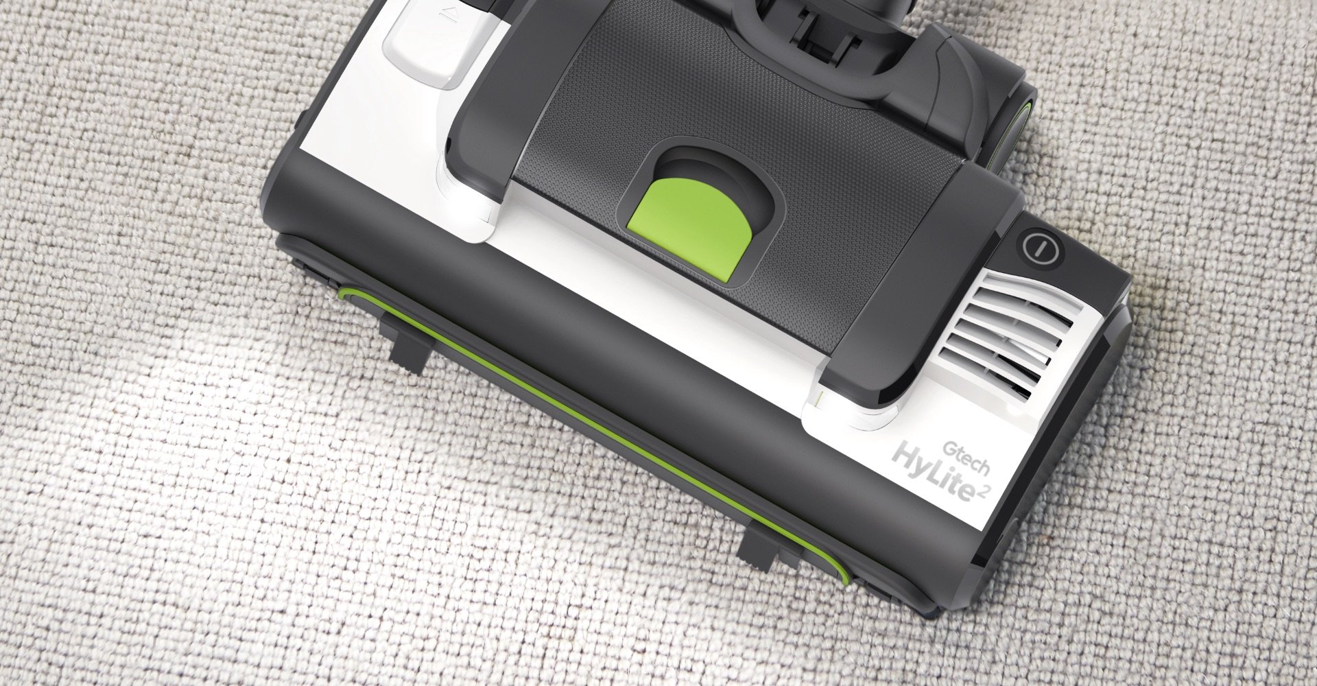
Gtech Visual Brand Language
As Gtech grew as a brand it became necessary to have a specified Visual Brand Language (VBL). A universal set of rules was defined to ensure that the brand’s visual identity was consistent across its growing range of products. The VBL consists of guidelines for CMF (colour, materials and finishes) as well as geometric and form consideration.

A universal colour palette was defined, which used white as the primary colour, with a new darker green being used for the highlight colour. Guidelines were also produced on how branding should appear, which focused on smaller sized logos and high quality foil prints where suitable.
Texture became a vital part of the Gtech Visual Brand Language. Firstly a specific and limited set of textures was defined, and then detailed yet flexible rules where written on how these textures should be used on product. Each texture has a purpose and communicates something about the product or part.

